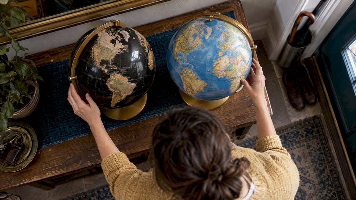
Choose a blue ocean globe if you want a map that reads as a map: familiar, legible and at home in a study or a family room. Choose a black ocean globe if you want an object that reads as design first: graphic, dramatic and at its best in a room with a mature, restrained palette. Both are good choices. The right one depends on where the globe will live, who will look at it and how often you plan to actually use it.
Below we compare the two on what matters once the globe is in your home: legibility, color, finish, materials, base and mounting, and long-term appeal. We make handcrafted globes in Italy, so we also say plainly what separates a sculptural piece from a shelf filler.
TL;DR
- Blue ocean globes are the classic choice: easiest to read, most versatile with other furniture, and the safer pick for gifts.
- Black ocean globes are the decor choice: high contrast, graphic and sophisticated, but less forgiving of weak printing and of bright, busy rooms.
- Material and mounting matter more than ocean color. Solid wood, a balanced base and a clean map surface decide whether a globe still looks good in ten years.
- Size changes the answer: a 12-inch globe is the common benchmark, while larger floor globes turn a black ocean into a statement piece.
- If the globe is for display and for hosting, look at a globe bar, where the ocean color sets the mood of the whole room.
Table of Contents
- What the difference really is
- Legibility: which one is easier to read?
- Color and mood in the room
- Materials matter more than ocean color
- Base and mounting: the detail collectors check first
- Size: why 12 inches is the benchmark
- Caring for a globe so it keeps its look
- Black ocean vs blue ocean at a glance
- Our perspective
- Where a globe bar changes the choice
- Find your globe at Zoffoli
- A short checklist before you buy
- FAQ
- Sources
What the difference really is
A blue ocean globe follows the convention most of us learned from: seas in blue, land in softer tones, borders and names in dark ink. Globes are mostly terrestrial or celestial, and terrestrial globes are the spherical maps of the world that most households own. The blue sea is simply the visual shorthand for water.
A black ocean globe keeps the same geography but flips the contrast. The sea becomes a deep, near-solid dark field, and the continents carry the color: metallic silver or gold, soft pastels, or vivid political fills. According to a product guide on black ocean globe designs, these pieces blend artistic minimalism with geographic representation, which is a fair description of how people buy them: as an object that happens to be a map.
Black ocean globes have a long collector following too. A collector’s blog on vintage globes discusses mid-century black ocean models with chrome airplane bases, and debates which are most desirable. So this is not a passing trend. It is an established style that keeps coming back because it works in modern interiors.

Legibility: which one is easier to read?
This is where the two styles differ most, and where honesty helps.
On a blue ocean globe, the sea is a mid-tone, so the lettering and borders sit on a gentle background. Fine type is easy to read in daylight, in lamplight and at a distance. If anyone in the household will actually use the globe to find places, plan trips or answer a child’s question, blue is the easier companion.
On a black ocean globe, the contrast is stronger, and that cuts both ways. Light lettering on black can be crisp and striking in good light. In dim rooms, or with thin dark text, legibility depends entirely on how the map was designed. A well-designed black map uses lighter land colors and clear type. A poorly designed one turns small labels into noise.

Precision matters more here, too. Black ocean globes can demand tighter printing, because any slight misalignment of borders against a high-contrast background is easy to spot. On a blue ocean map, subtle tonal variation can hide small registration errors. When you shop, turn the globe slowly and check where the colored fills meet the outlines. Clean edges are a sign of careful production.
Color and mood in the room
Blue ocean globes bring a sense of calm and tradition. The blues range from pale and antique to deep navy, and they sit comfortably beside wood, leather, linen and books. They suit a study, a library corner, a child’s room that will grow up with the object, or a living room with a layered, lived-in feel.
Black ocean globes bring weight and a quiet drama. They tend to anchor a space the way a dark vase or a charcoal frame does: they give the eye a place to rest. They look especially good against light walls, warm woods and brushed metals, where the contrast shows the form of the sphere. In a room already full of color and pattern, a black globe can feel heavy. In a calm, neutral room, it can be the single object that makes the space feel finished.
A practical rule: if your room is warm and traditional, start with blue or a classic antique-style map. If your room is modern, minimal or monochrome, black is often the more natural fit.
Materials matter more than ocean color
Buyers often compare ocean colors and overlook everything underneath. That is a mistake, because the same black or blue can look cheap or exceptional depending on what carries it.
Collectors often point out that heritage makers focus on craftsmanship, hand-finished assembly and better materials, such as solid wood supports, while mass-produced globes prioritize low cost and educational use. You can feel the difference in your hands:
- The sphere: a smooth, evenly finished surface without visible seams at the poles or equator.
- The support: solid wood or metal that feels dense, not hollow.
- The weight: a globe should spin freely but stay put. Lightweight plastic stands can feel unstable or tip when nudged.
- The finish: a clear, even protective coat, with no cloudiness or orange-peel texture.
Our own approach starts here. Zoffoli has made globes in Italy since 1949, and each piece is designed and produced as both a functional object and a work of art. Take our Vertigo Noir floor globe: Zoffoli’s Vertigo Noir is a 24-inch (about 60 cm) globe with a contemporary political map in indigo, a cellulose-and-polymer sphere and an Italian walnut support. It shows how a dark ocean can look warm and refined, not cold, when the wood and the map are chosen together.
Base and mounting: the detail collectors check first
Look at the equator. Many traditional globes carry a dark, heavy band around the middle that holds the sphere in its frame. On a blue globe, this band is an accepted part of the look. On a black ocean globe it can disappear into the sea, or it can cut across the map and clutter it.
Premium handcrafted globes often use more minimal mounting systems that keep the cartography continuous. When you compare two black ocean globes, ask three questions:
- Does the mounting hide part of the map, and which part?
- Is the base heavy enough to balance the sphere?
- Does the axis tilt at the traditional angle, and does the globe rotate smoothly?
The base is also where black ocean globes show their character. Chrome, brushed steel and walnut each give a very different personality. A metal stand reads industrial and modern. Walnut reads warm and tailored. If you are building a display with other pieces, a good stand can matter as much as the globe: even a simple metal display stand shows how a slim metal base lifts an object and gives it presence in a room.
Size: why 12 inches is the benchmark
The 12-inch (30.5 cm) globe is the most common size, reported to account for roughly 80% of consumer globes sold, because it balances readability with desktop space. It fits a desk, a console or a bookshelf without dominating it.
The ocean color changes how size feels:
- Small (under 10 inches): blue is friendlier and easier to read. A small black globe can look like an ornament rather than a map.
- Medium (about 12 inches): both work. Choose by room style.
- Large floor globes: black ocean pieces become sculpture. At around 24 inches, the dark sphere becomes a focal point you walk around.
Caring for a globe so it keeps its look
Dark finishes show dust and fingerprints more readily, so keep a soft dry microfiber cloth nearby. Keep any globe out of long, direct sun: strong light can fade printed colors over the years, and that is more noticeable on a map with a rich, solid ocean. If you collect antique-style pieces or maps and want to protect them, it helps to read how collectors think about protection, for example this note on acrylic versus glass for display cases, which also covers why UV exposure matters for anything printed.
For everyday use, a gentle turn is enough. Avoid pushing the sphere hard against the axis, and place the globe on a stable, level surface where it will not be knocked.
Black ocean vs blue ocean at a glance
| Criterion | Blue ocean | Black ocean |
|---|---|---|
| First impression | Classic, familiar, calm | Graphic, dramatic, modern |
| Legibility | Easy in most light | Excellent when well designed, harder in dim rooms |
| Printing tolerance | Forgiving of small errors | Shows misalignment quickly |
| Best rooms | Studies, libraries, family spaces | Neutral, minimal or monochrome rooms |
| Best as | A tool and a decor piece | A sculptural object |
| Gift safety | Very high | High, if you know their taste |
Our perspective
After decades of making globes in Italy, we see the ocean color as the last decision, not the first. Start with how you want the object to behave in your home: a quiet reference piece, a collector’s showpiece, or something that works for guests, like a globe bar.
A black ocean is a bold choice, and it rewards care. It asks for a better map, cleaner printing and a base that deserves to be seen. When those are right, nothing looks more sophisticated beside walnut, stone or brushed metal. When they are not, a blue ocean is the more honest choice.
For gifts, we suggest asking one question: does the person like a warm, traditional room or a sleek, modern one? That answer usually settles it. And if you are unsure, a classic map with a softer sea is rarely wrong.
— Zoffoli
Where a globe bar changes the choice
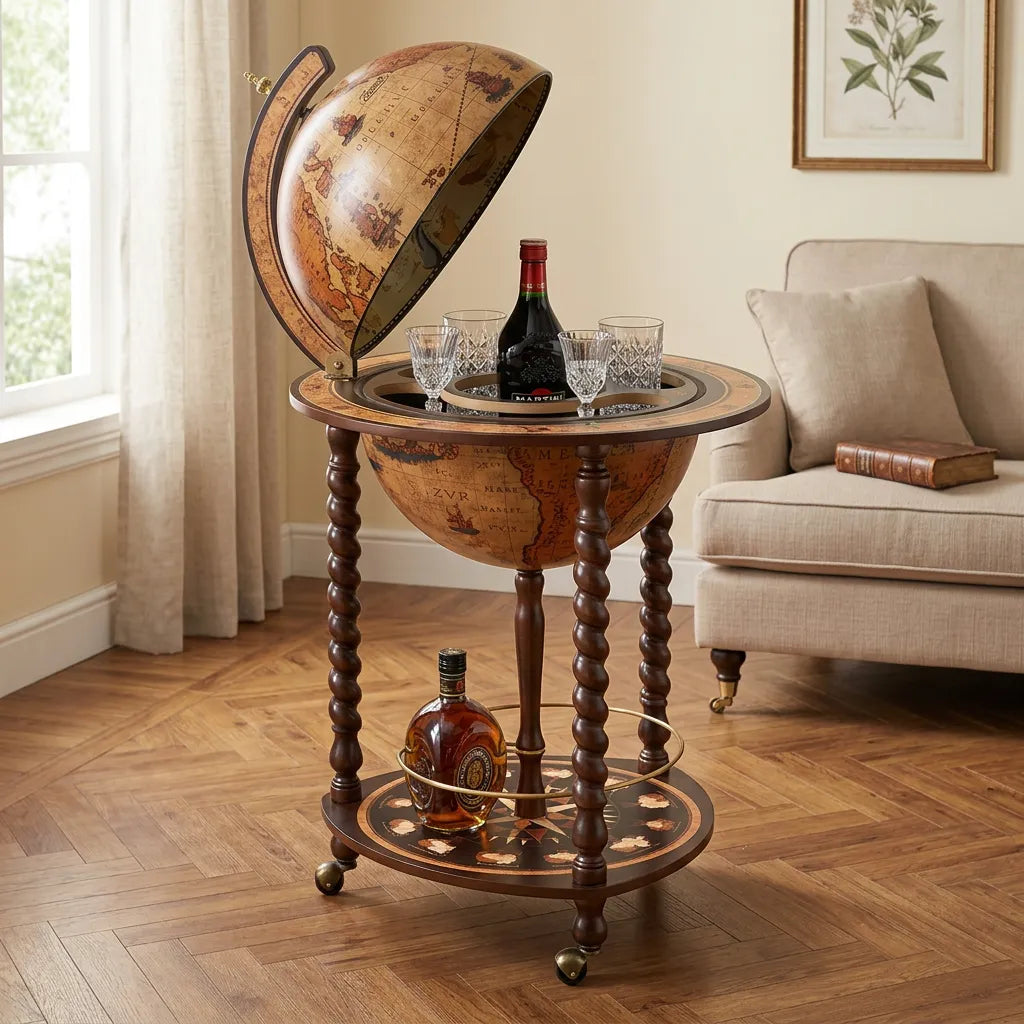
If you entertain, the decision shifts. A globe bar is a bar cabinet tucked inside a world globe, and Italo Zoffoli of Zoffoli invented the bar globe in the late 1940s in Rimini, Italy. When the sphere opens to reveal glasses and bottles, the exterior becomes the backdrop to a ritual. A dark sphere gives that moment theater. A blue, antique-style sphere gives it warmth and nostalgia.
In that case, ask how the piece will sit in the room when it is closed. It should look finished on its own, with no visible hardware competing with the map.
Find your globe at Zoffoli
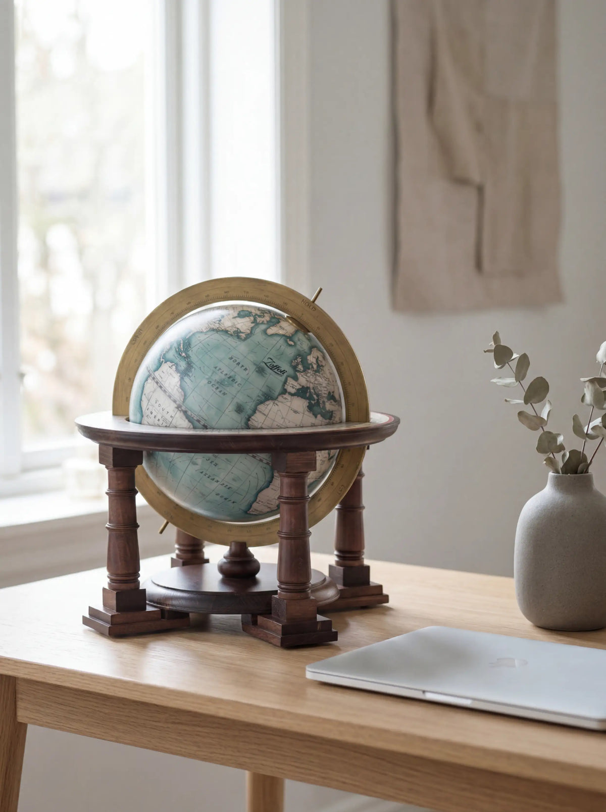
Our collections cover both moods. You can browse classic style globes for a timeless look, or explore our globe bars, table globes and floor globes from the Zoffoli homepage. For a bar with real presence, see the Vesuvio bar globe, and for the desk, the Gold Desk Globe. If you prefer a map as wall art, our Tele Antiche collection offers antique-style canvases. Our products have earned outstanding ratings on Trustpilot, and every piece is made in Italy.

A short checklist before you buy
Before deciding, walk through these points:
- Where will it stand? Bright, busy rooms suit blue. Calm, neutral rooms suit black.
- Who will use it? Frequent readers want blue or a very well-designed black map.
- What is it made of? Look for solid wood or metal, and a base with real weight.
- How is the map finished? Check borders and fills for sharp registration.
- How is it mounted? Find out what the mounting hides.
- Is it a gift? Choose the classic if you do not know the recipient’s taste.
If a piece passes all six, the ocean color becomes a matter of pleasure, which is how it should be.
FAQ
Are black ocean globes good for decor or only for show?
They are very good for decor, and they can still be read. The key is the map design: light land colors and clear type keep a black ocean globe practical. Choose one with careful printing if you plan to use it often.
Do black ocean globes go out of style?
They have a long history with collectors, so they are better described as a recurring classic than a fad. Vintage black ocean models are still discussed and collected today. Pairing one with natural materials such as walnut keeps it from looking dated.
Which is the better gift, black or blue?
Blue is the safer gift for a wide audience because it looks familiar and warm. Black suits someone with a modern, minimal or design-led home. If you know their taste, black makes the more memorable present.
What size of globe should I get?
A 12-inch globe is the common benchmark for desks and shelves. For a room with space to fill, a larger floor globe turns the object into a feature piece. Smaller globes are best kept to blue oceans, where the map stays easy to read.
Sources
- Globe, Encyclopedia.com
- Who invented the bar globe? 1stDibs Questions & Answers
- Black ocean globes to buy or not to buy, Collecting Antique and Vintage Globes
- Understanding Black Ocean Globe: Composition, Standards, and Applications
- Vertigo Noir floor globe by Zoffoli