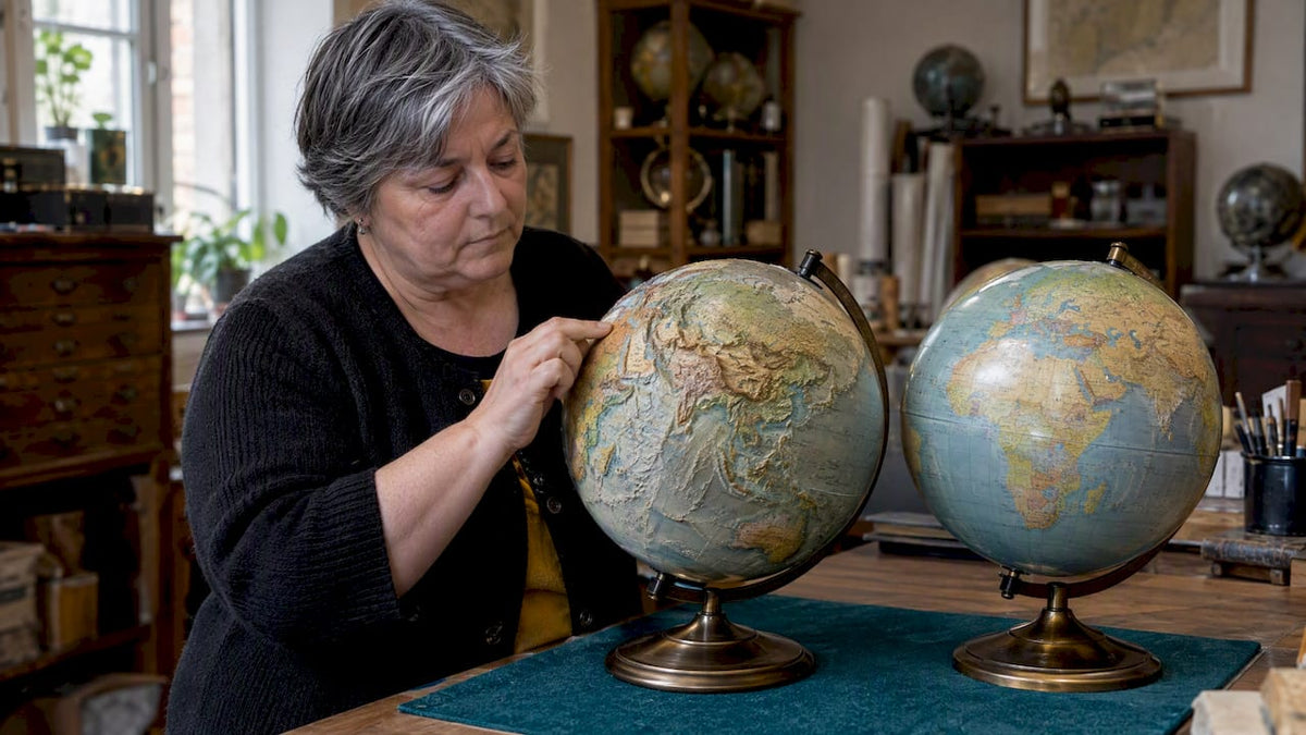
A raised relief globe has molded ridges and elevations you can feel and see in shadow. A smooth globe has a flat surface where terrain is shown only through printed color, shading and labels. Choose raised relief if you want a tactile, sculptural object. Choose smooth if you want calm, uninterrupted cartography that is easy to read and easy to dust. Neither finish is more “correct.” Each is better at a different job, and the right one depends on where the globe will live and who it is for.
This guide walks through how each finish works, what it does to a room, what it does to the map, and what to check before you buy, whether the globe is for your desk, your hallway or someone else’s birthday.
TL;DR
- Raised relief means physical, deliberately exaggerated elevation. Smooth means terrain is shown only through printed color and shading.
- Relief suits tactile, sculptural décor and physical-geography designs. Smooth suits dense labels, political maps and a refined, quiet surface.
- Raised mountains are never true to scale, and a taller ridge does not make a globe more accurate. Judge accuracy by map date, sources and labeling.
- Larger globes can carry gentler relief. Compact desk globes often need bolder molding to read at all.
- Compare the whole object: stand, meridian, cartographic edition, finish quality and how the maker explains its process.
Table of Contents
- What each finish actually is
- How raised relief is made, and why it is exaggerated
- Raised relief vs. smooth: the side-by-side view
- What raised relief does well
- Where raised relief falls short
- What smooth globes do well
- Matching the finish to the room and the person
- A buyer’s checklist for either finish
- Our perspective at Zoffoli
- Find your globe
- Common mistakes to avoid
- FAQ
- Sources
What each finish actually is
Esri’s GIS Dictionary defines a raised-relief globe as one on which the terrain surface is raised from the base elevation and exaggerated to give a more realistic impression of relief. In shopping terms, that means you can run a fingertip over the Himalaya, the Andes or the Rockies and feel them rise.
A smooth globe is the traditional form. The sphere is uniform, and the landscape is told through color: soft greens and ochres for lowlands, deeper browns for highlands, blues of varying depth for the ocean. Names, borders and graticule lines sit on an uninterrupted surface. It is the globe most people picture when they hear the word.
One point of vocabulary is worth settling early. Relief describes the surface treatment, not the kind of map. The encyclopedia entry on globes separates terrestrial from celestial globes, and the usual terrestrial trio is physical, political and thematic. A globe can be physical with raised relief, physical and smooth, political and smooth, or even illuminated with either construction. So when you compare finishes, you are really choosing a texture on top of a decision about content.
How raised relief is made, and why it is exaggerated
The mountains on a raised relief globe are taller than they should be, and that is intentional. ETH Zurich’s terrain-model team explains vertical exaggeration: on a globe only a few decimeters across, real elevations would be too small to perceive. Everest, at true scale, would be close to invisible.
NASA’s Spinoff account of a raised-relief Mars globe describes testing 7x, 20x and 40x relief and a production workflow that moves from digital elevation data to a shaped master, then molded copies, then hand finishing and painting. The lesson is useful for any buyer. Relief must be strong enough to notice, but too much overwhelms the natural form. The question to ask is not “Is it realistic?” but “Is the exaggeration legible and pleasing at this size?”
Scale changes the answer. ETH’s explanation suggests that as a globe gets larger, less exaggeration is needed for the same perceptibility. In practice, a large floor globe can look elegant with gentle relief, while a compact tabletop piece may need bolder molding to read from a few feet away.

A common relief-globe process also vacuum-forms at least two thermoplastic hemispheres or segments and then joins them, according to ETH’s description. That detail matters later, when we get to inspection.
Raised relief vs. smooth: the side-by-side view
| Consideration | Raised relief | Smooth |
|---|---|---|
| Touch | Invites tracing; ridges and basins can be felt | Uniform surface; nothing to feel |
| Light and shadow | Ridges catch light, shadows add depth | Even, soft reflection |
| Reading names and borders | Labels cross uneven ground, so dense lettering can be harder to read | Uninterrupted typography, best for dense labeling |
| Best map type | Physical or terrain-led | Political, classic or densely labeled |
| Cleaning | Dust settles in texture | Wipes clean easily |
| Accuracy of elevation | Stylized and exaggerated | Not shown physically; implied by color |
| Visual mood | Sculptural, modern or rustic | Refined, classic, calm |
The evidence supports a use-case distinction rather than a universal winner. Relief improves the physical perception of terrain. A smooth surface avoids exaggerated topography and visual texture, and lets the cartography or the color palette lead.
What raised relief does well
First, it makes geography felt rather than merely read. The size of the Tibetan Plateau, or the long spine of the Andes beside the Pacific, becomes obvious in a way a printed tint cannot match. For a curious child, or for anyone who enjoys handling objects, that is a real advantage.
Second, it gives a room a sculptural focal point. Raised ridges respond to the changing light of the day: a window in the morning throws one set of shadows, a lamp in the evening another. If you like decorative objects with surface character, the same logic applies to other sculptural accents in a home, where texture does the work that color alone cannot.
Third, it makes a memorable gift. A relief globe carries an immediate sensory surprise. The recipient notices the difference the moment they touch it, which is rare in a decorative object.
Where raised relief falls short
Relief is not the same as precision. NASA’s account and ETH’s guidance both make clear that the heights are stylized, and coverage may emphasize major mountain systems rather than every local feature. A raised surface is not automatically more accurate, and the apparent height of a mountain says nothing about whether borders are current or place names correct.
There is also a trade-off in legibility. Smooth globes remain the stronger choice for reading boundaries, place names and overall visual continuity when the surface is densely labeled. If you want to find a small island nation or a border town, an even surface helps.
Finally, relief introduces its own distortion. A globe preserves relationships among area, direction and distance better than a flat map, but exaggerating elevation adds a separate visual distortion in the vertical dimension. This is fine as long as you know it is there.

What smooth globes do well
A smooth globe is the quiet choice, and quiet is often what an interior needs. The sphere reads as a single, unbroken form, which pairs well with dark wood, brass, leather and stone. The surface lets the palette carry the mood: a warm, aged tone for a library, a pale, modern tone for a minimalist living room.
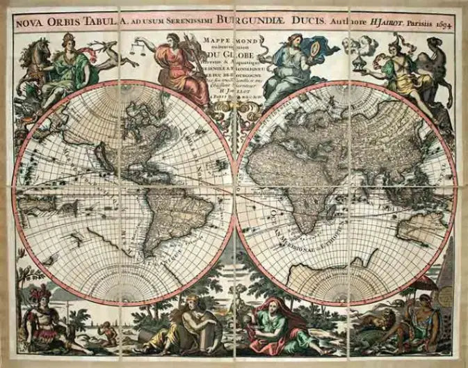
It also ages gracefully. A smooth surface is easy to wipe, simple to keep clean and, when printed with a classic or antique-style map, produces that vissuto, lived-in warmth that many collectors prize. The map stays in command: lettering runs clean, borders are crisp and the eye moves across the sphere without interruption.
The drawback is the one you would expect. Terrain is suggested, not shown. You see where the mountains are, but you cannot feel them.
Matching the finish to the room and the person
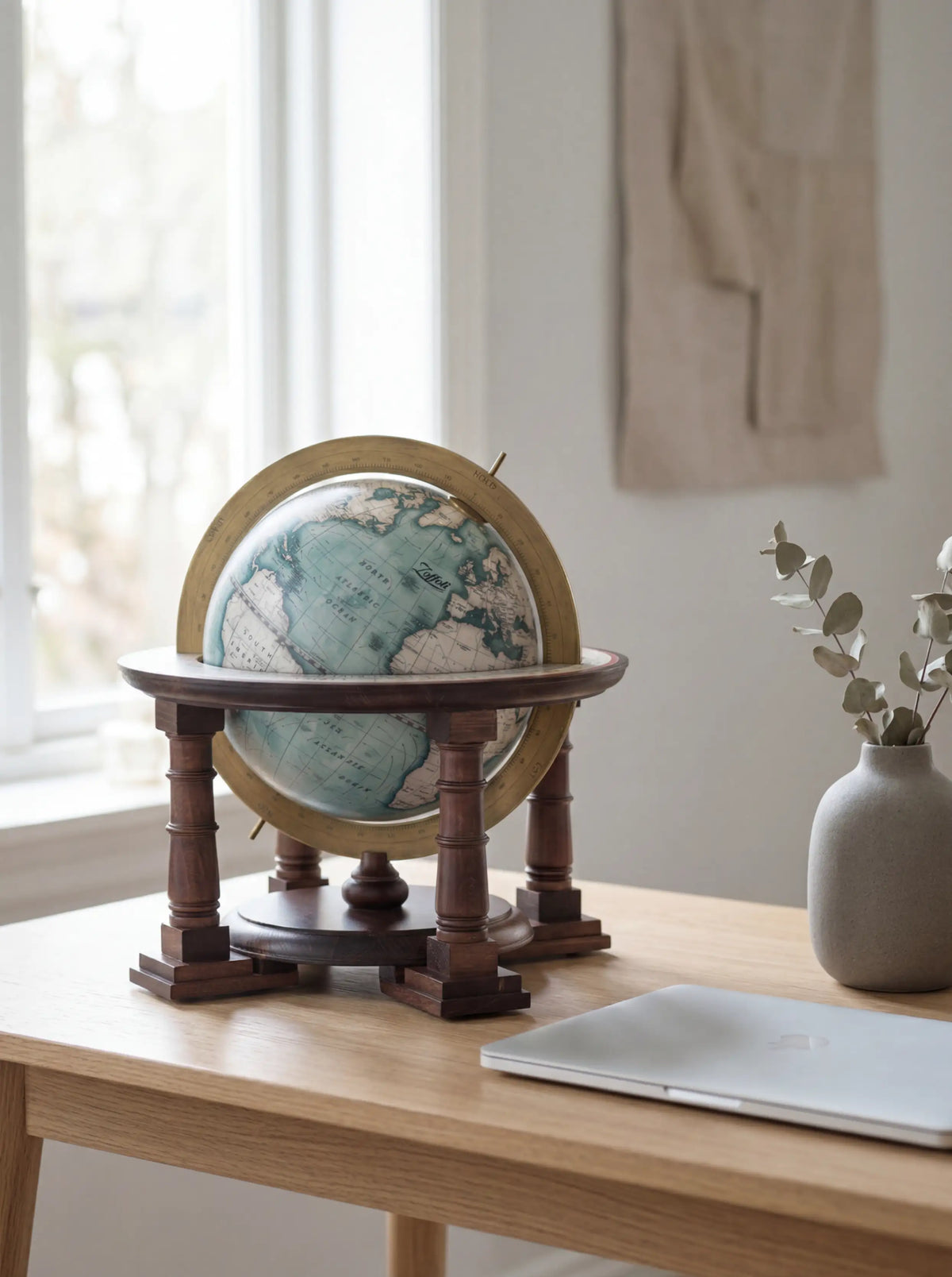
A study, library or executive office. A smooth globe, ideally with a classic cartographic style and a handsome stand, is usually the natural fit. Dense labels reward close reading, and the surface stays dignified. Our classic style globes and desk globes are made for exactly this kind of setting.
A large living room or entrance hall. Here scale is on your side. A floor globe is read from a distance and appreciated as furniture. A smooth surface keeps the form calm, and a relief surface, if you choose it, can stay gentle. Browse our floor globes to see how stand and sphere work together at full height.
A modern interior with strong textures. If the room already has stone, plaster or felt, relief can echo those textures. If it is already busy, a smooth sphere gives the eye somewhere to rest.
A child’s room or a curious teenager. Relief is more engaging to the hands. Remember, though, that dense labeling is easier to read on a smooth surface, so think about what the child will do with the globe.
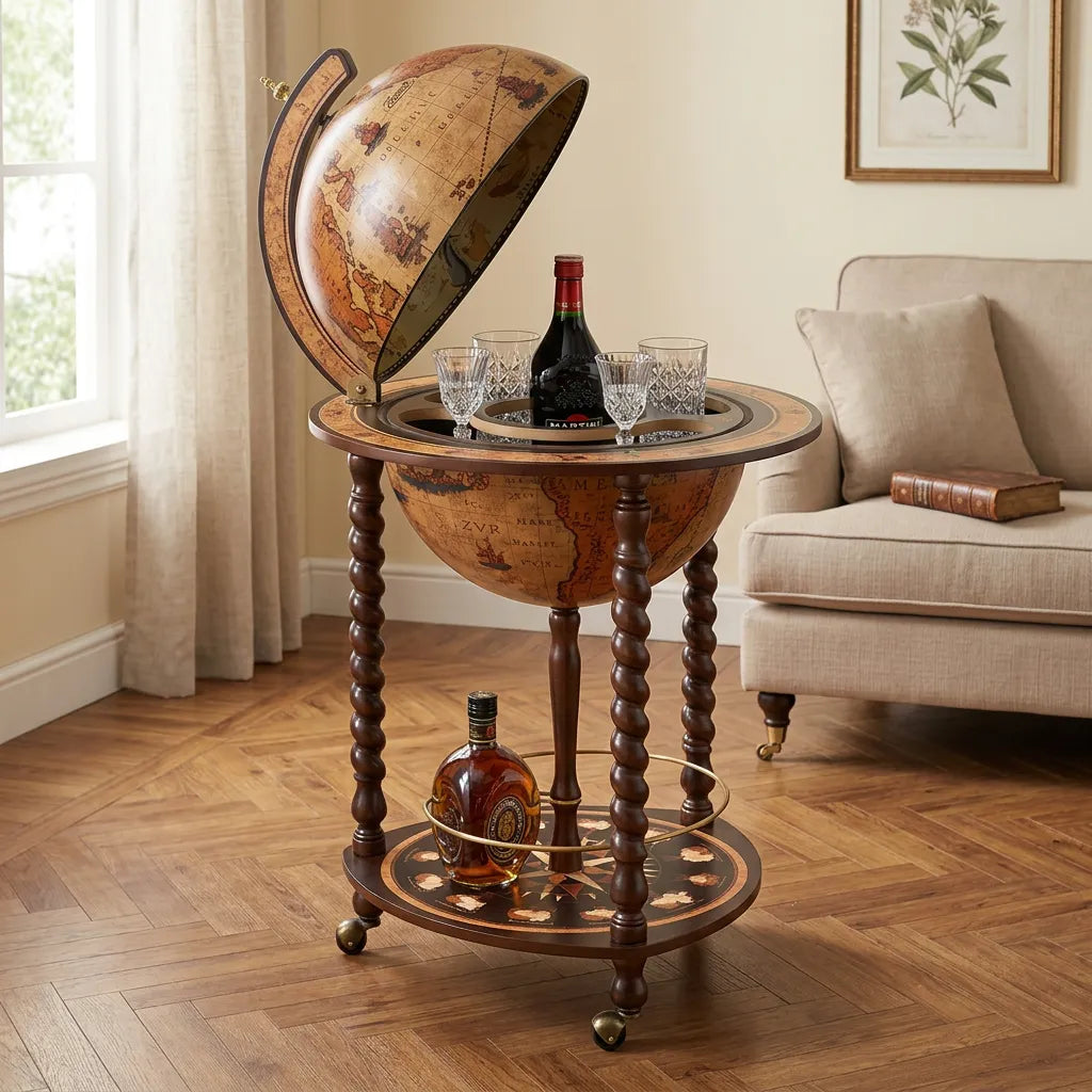
A bar or entertaining space. The finish matters less than the function. A globe bar opens to reveal a compartment for bottles and glasses, and its surface should be beautiful and durable. Our Vesuvio bar globe is one example.
A gift. Think about the recipient’s habits. A tactile person, or someone who likes to handle things, will love relief. Someone who collects antique maps or appreciates fine cartography will probably prefer a smooth sphere with a beautiful print. For clients and colleagues, see our page on corporate gifts.
A buyer’s checklist for either finish
Whether you choose relief or smooth, compare the whole object, not just the surface. NASA’s description of the production workflow shows why manufacturing method affects both tactile quality and collectibility. Before you buy, look at these points:
- The map edition. Check the date and what it covers. Updated cartography is a quality marker on any globe.
- Label hierarchy. On a smooth globe, lettering should be clear and balanced. On a relief globe, check that names remain readable across raised areas.
- Relief coverage and height. Ask whether relief covers major mountain ranges only, or also the sea floor, and whether the exaggeration looks convincing at the globe’s size.
- Seams and poles. Because relief globes are often formed from joined segments, inspect the join, the pole areas and the paint transitions in close-up photos. These are places where handcrafted work can show character, and also where uneven finishing is easiest to notice.
- Stand and meridian. Wood, metal and finish quality shape the whole impression. A fine sphere on a flimsy base disappoints.
- Viewing distance. Will it sit on a desk you lean over, or across a room? That decides how much relief you need and how fine the lettering can be.
- Illumination. Some globes light up from within. Lighting can be combined with either smooth or relief construction, so decide whether you want a lamp as well as a map.
- Maker transparency. A good maker explains how the surface was formed and finished, and where the globe was made.
Our perspective at Zoffoli
We have made globes in Italy since 1949, and the question we hear most is whether more texture means more quality. It does not. Quality lives in the cartography, the materials, the hand finishing and the way the sphere sits in its stand.
We think of a globe as a functional object and a piece of art at once. That is why we care about updated cartography, fine materials and the proportions of the whole piece, and why our collections span classic and modern designs, from desk globes to floor globes and globe bars. When someone asks us which finish is better, we ask where it will stand, who will look at it and what they will do with it. A globe that is admired daily and consulted occasionally needs a different surface than one made to be touched.
Our advice is to trust your eye and your hands. Choose the globe that makes you want to walk over to it.
— Zoffoli
Find your globe
If you are leaning toward a refined, classic surface with artisanal Italian craftsmanship, explore our desk globes, our floor globes, the collectible Gli iconici line, or the full range on the Zoffoli Living store. Each piece is designed and produced in Italy.

Common mistakes to avoid
The most frequent error is buying relief because it sounds more advanced. It is a different surface, not a superior one. The second is assuming a tall mountain range means a detailed or current map, when relief and cartographic quality are separate things. The third is ignoring the room: a heavily textured globe on a crowded shelf can look restless, while a smooth sphere in a bare corner can feel flat. Finally, many buyers forget to ask how the globe will be cleaned. Texture holds dust, and smooth surfaces simply wipe clean.
FAQ
What does raised relief mean on a globe?
It means the terrain surface is physically raised from the base and exaggerated, so mountains and plateaus can be felt and seen in shadow. Esri’s dictionary describes it that way. The heights are stylized, not true to scale.
Is a raised relief globe more accurate than a smooth one?
No. Raised relief adds a tactile impression of terrain, but it exaggerates elevation on purpose, as NASA’s description of relief globe production shows. Accuracy depends on the map’s date, data sources, labels and boundaries.
What are the three types of globes?
For terrestrial globes, the practical trio is usually physical, political and thematic, as the encyclopedia entry on globes outlines. Globes are also grouped more broadly as terrestrial or celestial. Relief is a surface finish that can be combined with any of these.
Which finish is better for home décor?
Choose raised relief if you want a tactile, sculptural piece whose ridges catch the light. Choose smooth if you want visual calm, clear lettering and easy cleaning. For a classic study or library, most people find a smooth globe the more natural companion.
Sources
- Raised-Relief Globe Definition, Esri GIS Dictionary
- Relief Globes, ETH Zurich Terrain Models
- Raised Relief Mars Globe Brings the Red Planet Closer, NASA Spinoff
- Globe, Encyclopedia.com